.webp)
This month at Polar Hedgehog, we’re sharing a look into the projects, ideas, and product work that shaped November. From animation and technical storytelling to Webflow development and large-scale redesigns, our team tackled a wide range of challenges across industries. Below are a few highlights from what we created, explored, and shipped over the past few weeks.
For Bananaz, we created a product animation that introduces their new Design Agent, a tool built specifically for mechanical engineers who work with complex CAD environments. Our goal was to translate the depth of this feature into a visual story that feels clear, intelligent, and immediately usable.
We joined the project early, working closely with the team to understand the product narrative before any visuals were created. From an initial outline and early concept notes, we shaped the flow into a storyboard, mapped the interactions, and defined how the product should move, respond, and feel. This process helped us build an animation that not only tells the story but reflects the way the tool actually behaves.
The final animation highlights the agent’s core promise, the ability to talk to your design. Instead of presenting a generic chatbot interaction, we showcased how the agent understands real engineering context, reading CAD files, analyzing geometry, and responding directly on top of the design itself. Smooth transitions, a minimal interface, and clear on-design responses create a sense of immediacy and confidence.
We kept the visual language aligned with Bananaz’s brand, with subtle motion, a clean environment, and sound and rhythm that make the tool feel modern and effortless. When switching to the 3D view, the animation shows how the agent interprets the model and provides contextual insights, reinforcing that this is more than a text tool - it is an expert built into your workflow.
By combining functional storytelling with a refined visual voice, the animation positions the Design Agent as an advanced, intuitive, and ready-to-use part of the mechanical design process.
See the full animation:

This month on the Polar blog, we explored Spark Hire’s new Webflow integration and why it is a major upgrade for anyone managing a Careers page. Until now, teams had to choose between Comeet’s rigid embed or a fully custom Webflow CMS that required constant manual updates. One option limited design, the other created workflow headaches.
Spark Hire finally closes that gap. Their new integration syncs open roles directly into a Webflow CMS Collection, so HR teams keep working in Spark Hire while marketing and design teams gain full creative control inside Webflow. No more mismatched styling, no more duplicated work, and no more stale job posts.
In the full post, we break down how the integration works, show real examples from clients like Addressable and Adaptive6, and share why this change matters for teams who care about both design and efficiency.

Webflow’s new App Gen is now in public beta, and it introduces a major shift in what teams can build inside Webflow. Instead of stopping at marketing websites, creators can now generate full-stack web experiences directly in the platform using simple prompts. App Gen builds everything on top of your existing design system, uses your components and variables, and connects seamlessly to your CMS content.
As Webflow experts, we see this as a meaningful addition to the workflow, especially for projects that need calculators, directories, or other functional sections that previously required custom development. Being able to generate production-ready app logic, styled automatically to match the site, opens the door for faster iterations and more sophisticated builds.
Apps deploy with a single click to Webflow Cloud, and while App Gen is free during beta, production apps follow Webflow Cloud pricing. To enable it, just toggle Webflow AI inside your Workspace settings.
It is still early, but even in its beta version, App Gen expands what’s possible inside Webflow in a way that fits naturally with the tools we already use every day at Polar.

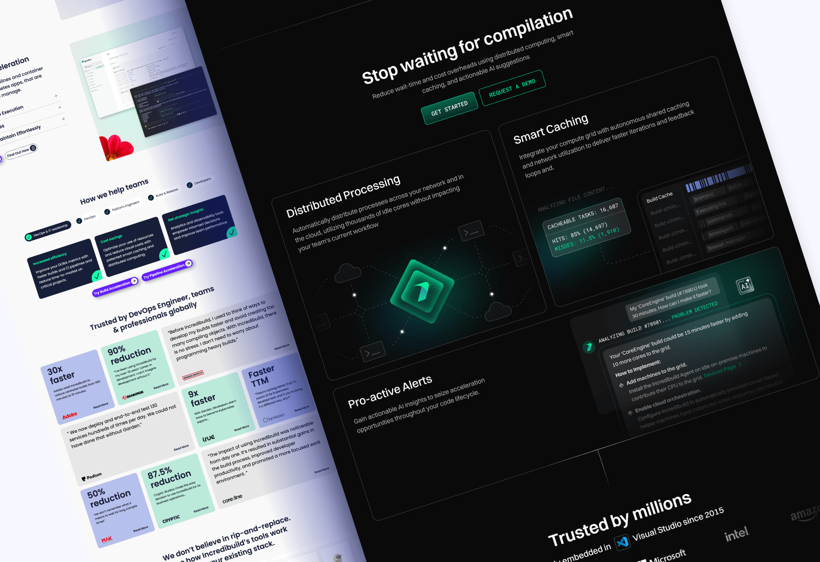
Incredibuild is a powerful and established platform built to accelerate C++ builds using parallelization, caching, and distributed computing. Their technology eliminates bottlenecks across the SDLC by breaking builds into parallel tasks, retrieving cached outputs, distributing workloads across available CPUs, and scaling seamlessly across on-prem, cloud, or hybrid environments. As their product expands with capabilities like observability, AI-driven insights, and automated actions across the pipeline, the brand needed a website that communicates this evolution with clarity and confidence.
When we partnered with the Incredibuild marketing team, our process began with understanding their audience and updated positioning. The brief highlighted a shift away from purely enterprise messaging toward speaking directly to DevOps, developers, platform engineers, and security teams - roles that care about performance, visibility, and automation at every stage of the pipeline. This guided our content structure, visual hierarchy, and overall storytelling.
The previous site communicated the product’s strength but lacked a unified visual language that matched the sophistication of Incredibuild’s modern platform. Their new product introduces observability, insights, and automated actions across the SDLC, yet the site experience didn’t fully reflect that shift or support a clearer segmentation for the different domains within the product.
Our redesign established a focused, modern, technical visual identity built around a dark interface with gradients of green and blue, echoing the color direction Incredibuild gravitates toward.

We introduced a structured color-coding system for their product domains, aligning with the early access areas this product now targets - Devs, QA and Testing, and Security. For the legacy version, we preserved the original green and blue hues that remain strongly associated with the brand.
Motion plays a central role in the redesign. We added smooth, purposeful animations inspired by the ideas of pipelines, speed, and distributed process flow. These elements reflect the core experience of using Incredibuild and tie directly to their product narrative, extending from the hero section through supporting components all the way to the CTA.


Because the website is large and serves multiple technical audiences, we spent significant time restructuring the navigation. We prioritized the most important pages first - to create a clear and scalable foundation for the ongoing rollout of new pages.
This transformation is still unfolding, with new pages being released as the product grows. We are excited for the next phase, and for continuing to support a company that pushes the boundaries of performance and developer experience.

