
Marketing at Polar is never about one asset at a time. It’s about building systems, documentation, landing pages, websites, and templates that work together and scale with the team behind them. In this Polar Update, we’re sharing a snapshot of how we approach marketing materials day to day, from structured documentation and AEO-ready content to on-brand Webflow templates and full website launches, all designed to help startup marketing teams move faster with confidence.
For Tencyle, a startup transforming security operations with autonomous, AI-driven threat detection and investigation, we had the opportunity to design and build a website that reflects both their technology and their brand personality. Tencyle harnesses large language models and automation to help SOC teams reduce alert overload and focus on meaningful security work.
At the heart of the site is a custom hero animation featuring a biker character, designed to visually represent Tencyle’s “autopilot” approach - analyzing data, gathering context, and verifying actions with speed and precision. This playful character became an ongoing theme throughout the site, inspiring colorful visual patches related to both the racing world and SOC automation, which appear as users scroll through sections of the site.
To bring more interactivity and delight to the experience, we added a drag-and-play CTA section where visitors can interact directly with elements on the page, reinforcing the dynamic, hands-on nature of Tencyle’s automation platform.
In addition to the homepage, we structured multiple pages for Tencyle’s launch, including:
Each page was designed not only to communicate Tencyle’s offering clearly and confidently but also to extend visual cohesion and brand voice across the entire experience.
.png)
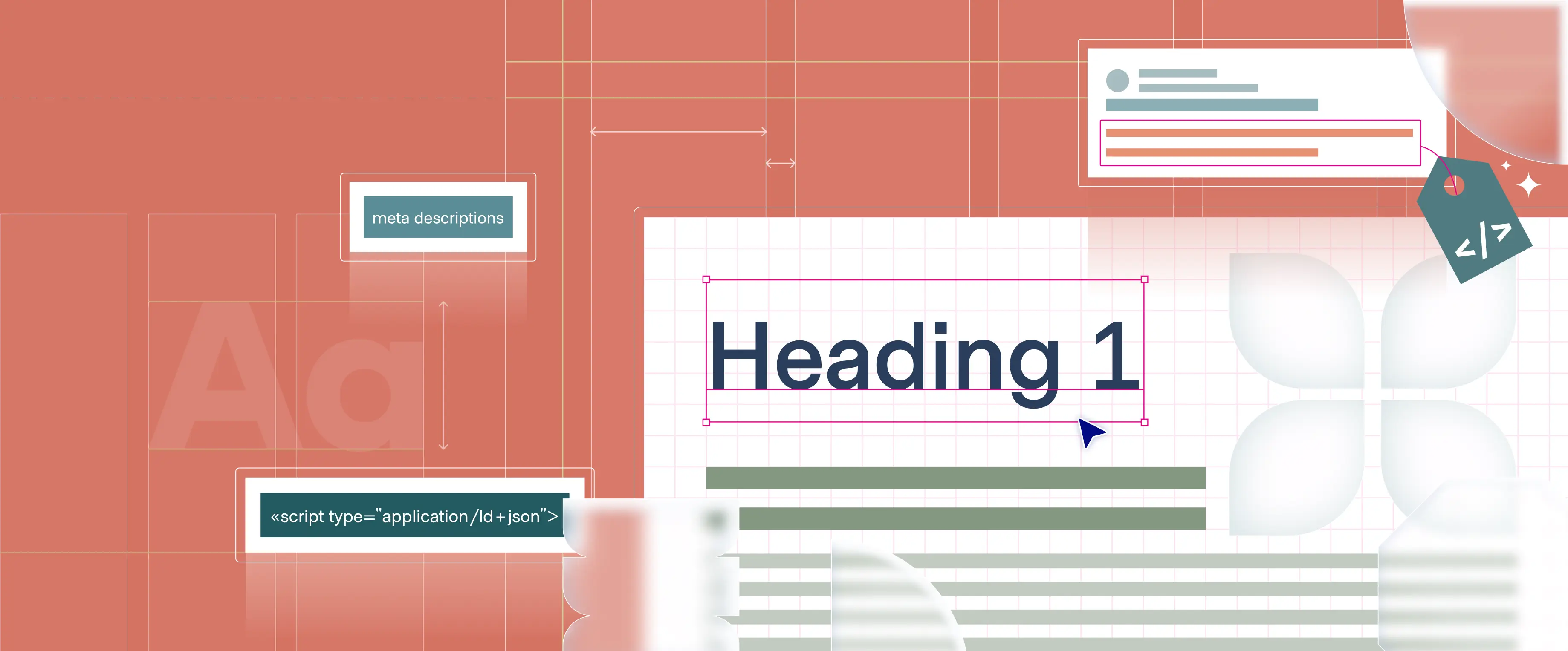
Search is no longer just about ranking on Google. People are asking AI direct questions and expecting clear, trustworthy answers. That shift changes how brands need to think about visibility.
In this article, we break down what Answer Engine Optimization (AEO) really means, why it matters now, and how we help clients prepare their Webflow sites for AI-driven discovery. From structured content and technical foundations to authority signals and measurement, this is a practical look at how to make your website understandable and credible for both humans and LLMs.
If you want to understand how AI systems read your site and what it takes to show up inside real answers, not just search results, read the full post.
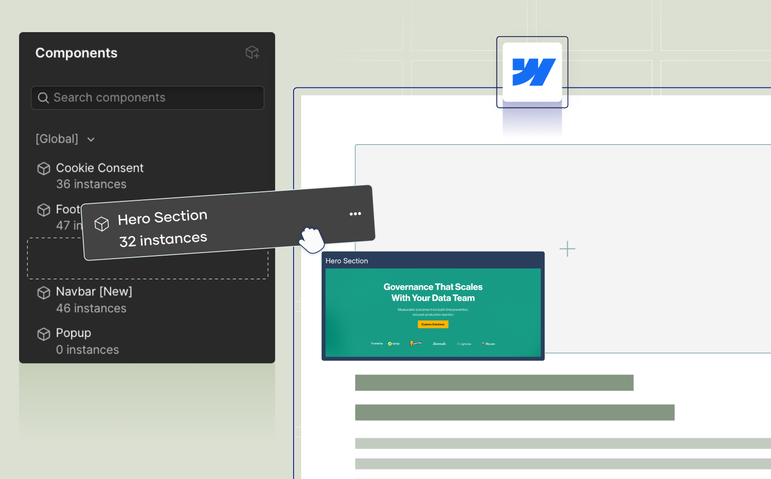
One of the ways we help startup marketing teams move faster, without sacrificing brand consistency, is through custom landing page templates built directly in Webflow.
Using Webflow’s page templates, we design and standardize landing page structures that marketing teams use again and again, product launches, events, campaigns, and announcements. Each template is built on approved layouts, spacing, typography, and components, so every page stays fully on-brand from the first section to the last.
Our process starts with defining the sections your team needs most, hero blocks, feature grids, social proof, CTAs, and supporting content. We then build these sections into flexible, designer-approved templates inside Webflow. Once the template is ready, marketing teams can create new landing pages on their own, without touching complex layouts or worrying about breaking the design.
This approach gives marketers more autonomy and speed. They can self-serve landing pages in a safe environment, launch campaigns faster, and iterate without waiting on design or development, while the structure, style, and brand system remain intact.
At the same time, designers keep control. The templates act as a framework and a guardrail, ensuring consistency across every campaign and freeing the team to focus on more strategic work instead of rebuilding pages from scratch.
The result is a scalable system for startups, landing pages that move as fast as marketing needs them to, without compromising quality, clarity, or brand integrity.
In the world of marketing, clarity and structure are just as important as visuals. Whether it’s a one pager, a sales deck, a technical case study, or a full white paper, well-designed documentation becomes a strategic tool, one that supports messaging, strengthens credibility, and helps teams communicate with confidence.
Our approach starts with the foundation, a flexible grid, consistent spacing, and text hierarchies that make every page easy to navigate. From H1 to body copy, callouts, bullets, and diagrams, each element is designed to guide the reader and keep the content sharp and digestible. Light graphic elements tie everything back to the brand, adding character without overwhelming the message.
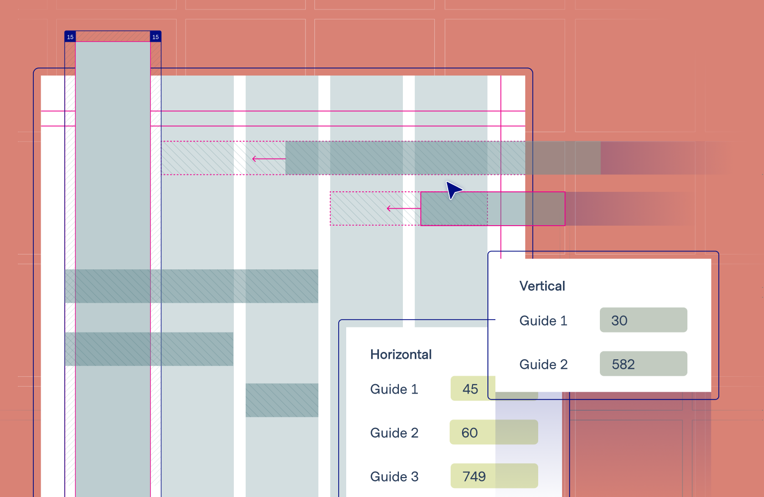

But beyond the system itself, we believe in design that elevates the content, not just decorates it. Even when the material is dense or “dry”, thoughtful layout and structure can create flow, rhythm, and genuine interest. We treat the grid and the concept as the backbone of the document, a framework that informs every decision that follows.
This process includes breaking down the content into clear layers, identifying what deserves emphasis and what can stay as supporting context. It means knowing when a section should become a full-page opener, when a graphic can strengthen a message, and when a simple text block is all that’s needed. In some cases, a running header or visual anchor helps maintain continuity across long documents; in others, links, references, or side notes keep the reader oriented.
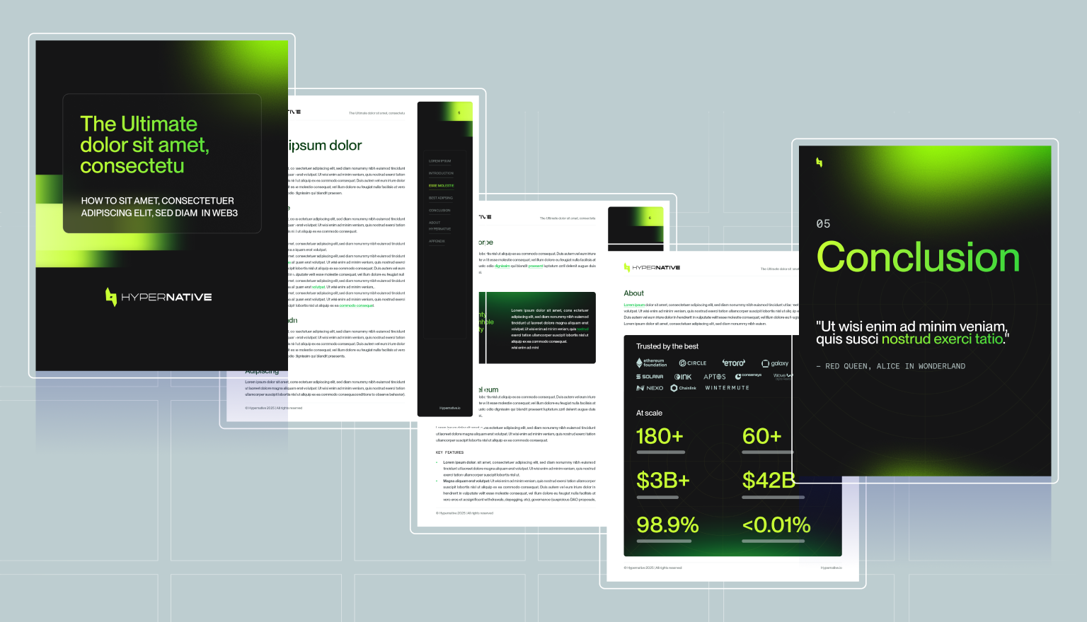
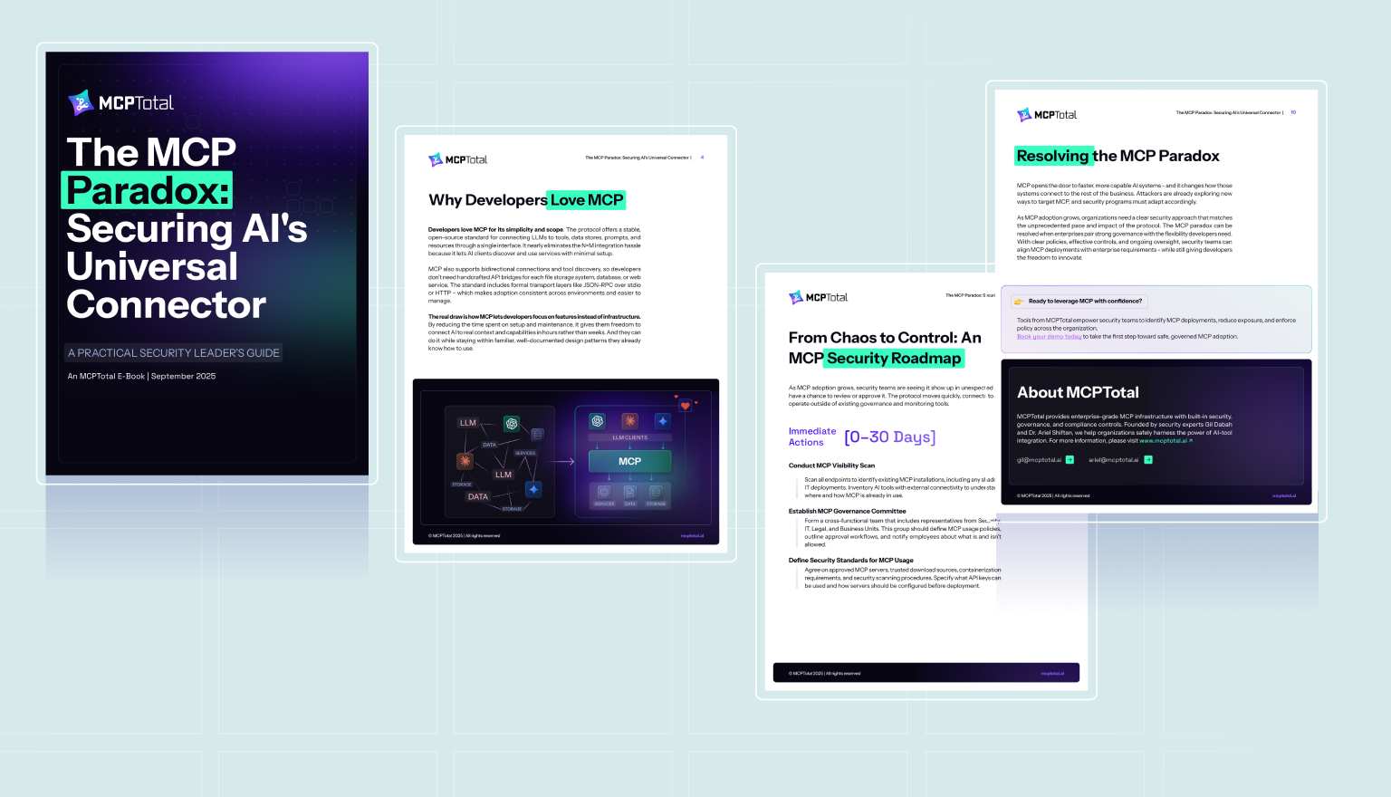
The result is documentation that feels intentional and confident, materials where the design leads the reader, sharpens the message, and turns complex information into something both clear and genuinely compelling.
Let’s design documentation that clarifies, structures, and elevates your message
.webp)