Blog
The Soul of the Startup: Designing Characters That Shape Perception
Visual
7
min read
The Soul of the Startup: Designing Characters That Shape Perception
Feb 12, 2026


We work with startups operating in complex domains like Cyber Security, Web3, DevTools, and SaaS. The technology is often brilliant, but the story behind it is hard to explain. Concepts are abstract, systems are layered, and value is not always immediately visible.
At Polar, we work where brand, product, and technology intersect. Our role is to take complex systems and turn them into clear, approachable narratives. One of the most powerful tools we use to do that is the brand character.
This is not about drawing a mascot for a t-shirt. It is about designing a narrative device. A visual anchor that gives the brand a face, a voice, and a consistent personality across product, web, marketing, and story.
Here is how we build them.
Before we draw a single line, everything starts with strategy.
We do not ask, “What should the character look like?”
We ask, “What role does this brand need to play in the mind of its audience?”
Different audiences require different emotional cues. A CISO looks for authority and control. A developer responds to clarity and wit. A founder needs confidence without noise. The character has to support that psychological role.
This is where the brief becomes critical. We define the character’s purpose, personality, tone, and function. Not as abstract traits, but as concrete responsibilities inside the brand and the product.
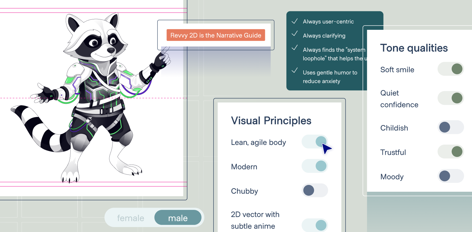
When working on Revenium, a startup operating in the Agentic Economy, we defined a dual archetype before touching any visuals:
This strategic definition ensured the character was not just appealing, but useful. It reduced fear around AI driven complexity and replaced it with clarity and confidence.
Once the strategy is set, we move into concept development.
This phase is about finding the right visual language. We explore and then narrow down references until a clear logic emerges. We debate the vibe, the tone, and the stylistic direction.
Should the character feel organic or technical?
Flat or dimensional?
Illustrative or abstract?
This is not an aesthetic exercise. Every stylistic decision must support the role defined in the brief.
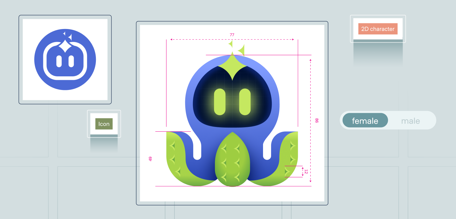
For Tamnoon, a Cloud Security Remediation platform, the name points toward an octopus. But a literal sea creature would have felt too biological and chaotic for a clean, cloud based security environment.
We designed Tami as a context-aware, intelligent entity rooted in the octopus metaphor, without leaning into biological or animalistic behavior. The octopus serves as a conceptual foundation rather than a literal representation. Through simplified geometry, controlled symmetry, and a calm visual language, Tami shifts from a sea creature into a technological agent.
Her expression is minimal, her form is stable, and her glow is intentional. The subtle sparkles and light accents reference AI driven intelligence, signaling continuous analysis and context awareness without visual noise. These choices communicate reliability, clarity, and control, allowing Tami to feel approachable without becoming playful, noisy, or overly expressive.
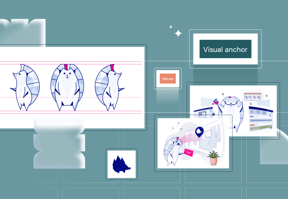
In complex tech brands, a character cannot be a single illustration. It has to function as a system.
It needs to scale from a 16px favicon to a product UI, to white papers, to social media and conference booths. To make that possible, we design characters in layers, each with a clear role and level of expression.
The Product Anchor
This is the most reductive and functional version of the character. Abstract, sharp, and symbolic.
For Revenium, the client already had a strong, geometric raccoon symbol that anchors the brand. Our job was to understand its visual language and ensure every additional character layer spoke the same dialect.
The same logic applied to Tami. Alongside the full character, we designed a simplified icon version that could function inside the product itself. This icon anchors the AI agent within the interface, ensuring consistency between the product experience and the broader brand language.
The Technical Guide
This is the most critical and most challenging layer. It sits between abstraction and emotion.
Revenium arrived with two extremes. On one side, a highly abstract icon. On the other, a cinematic 3D character generated using AI tools. While visually impressive, this approach came with inherent challenges: limited consistency, reduced control, and difficulty integrating the character into structured product and technical contexts.
What was missing was the bridge.
You cannot place a cinematic 3D render inside a technical diagram. It is too noisy.
You cannot rely on a logo alone. It carries identity, but not guidance.
Our solution was defining and designing Revvy’s middle layer.
While Revvy already existed as an abstract icon and a cinematic 3D character, we created a functional, product ready version that could live inside technical content.
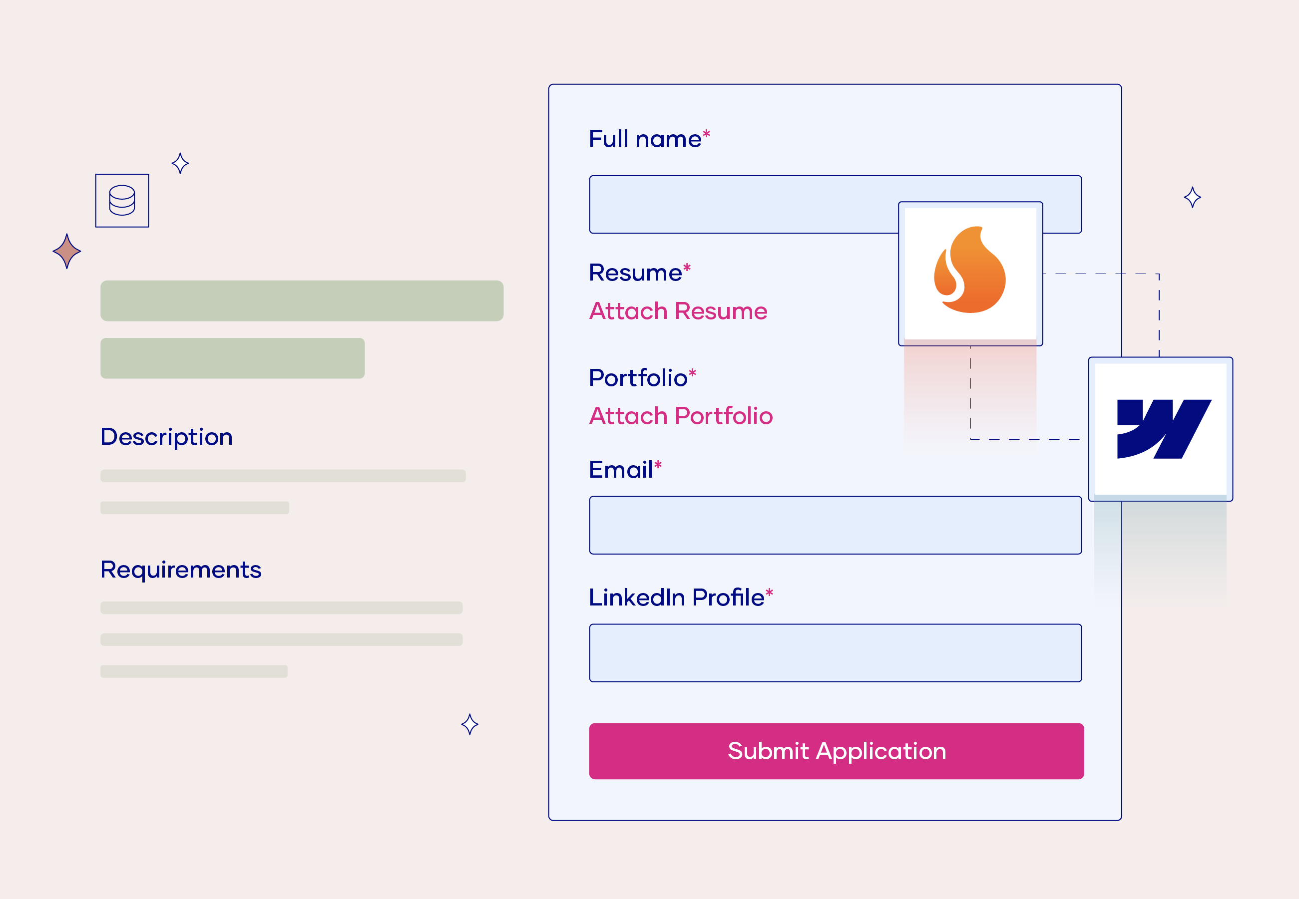
Revvy was created as a 2D, vector based support character. Calm, confident, and precise. He connects nodes, highlights risks, and guides users through complex diagrams and flows.
He was designed as a guide rather than a hero. Supportive, intelligent, and present when needed, without ever stealing focus. There is warmth and wit in his presence, but it is restrained and purposeful, grounded in a technical, contemporary aesthetic.
Revvy was designed to support the content, not compete with it. His role is not to express personality, but to make complex systems readable. This allows the character to live inside white papers, product explanations, and system visuals while staying precise, functional, and unobtrusive.

The Brand Expression
This is the most expressive and flexible version of the character, used outside the product for brand presence and engagement.
For Tamnoon, Tami expands in this layer into illustrative scenes and expressive moments. She becomes the face of the brand in marketing and events, allowing Tamnoon to be perceived as approachable and confident rather than just another security vendor.
Not every character enters the process as a clean slate.
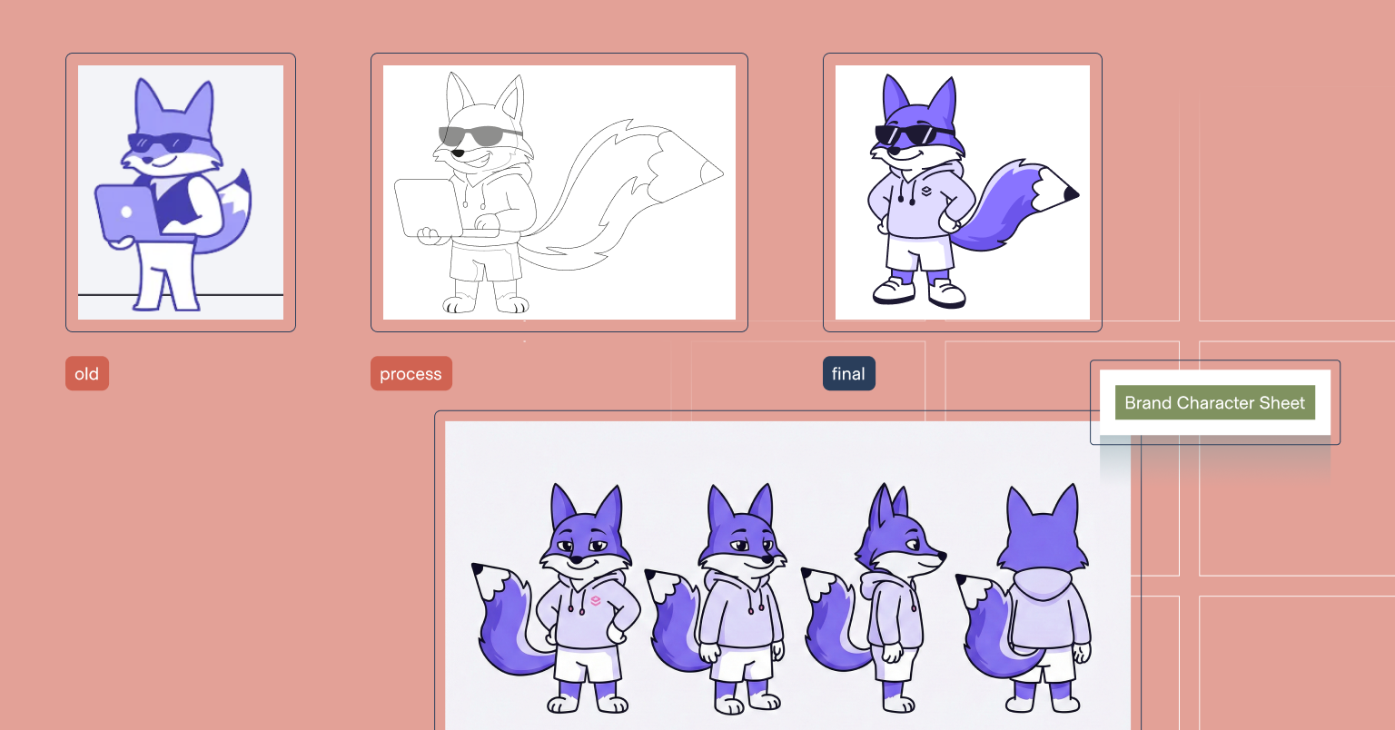
In some cases, the work starts with an existing character that already lives across brand assets. This was the case with Draftt. The fox character, Sketch, already had recognition, structure, and visual consistency. What it lacked was clarity of intent.
Even without a deep character brief, the same system thinking applied. Instead of redesigning the character, we focused on refinement. Clarifying what the character should express, strengthening key elements like the pencil in his tail, and sharpening details such as line weight, posture, and expression.
By testing the character across gestures, angles, and states, Sketch evolved into a clearer, more confident brand character. Not new, but more intentional. A character that could function as part of the brand system rather than a single static illustration.
We aren’t just creating visuals. We design brand systems that scale across product, web, marketing, and story.
That means knowing when a character should disappear, when it should guide, and when it should lead the story.
In the startup world, teams are often selling ideas people cannot fully see yet. Our role is to give those ideas form, structure, and personality. By combining deep technological understanding with a structured character design process, we help brands turn abstraction into meaning.
When character design is done right, it does not decorate the brand.
It carries it.
Ready to shape how the world perceives your technology? Let’s build your story.