In the competitive world of B2B software, buyers don’t just buy sets of features, they buy confidence, credible futures, and trustworthy solutions. When your visual identity, brand experience and overall look and feel reflect the professionalism and clarity of your solution, you accelerate credibility.
At Polar Hedgehog we’ve seen this in action across countless tech startups in highly technical fields such as Cybersecurity, AI, Web3, Cloud infrastructure, FinOps, etc.


Design has a powerful, immediate impact on how a company is perceived, especially in B2B SaaS, where buyers rely on subtle cues to assess risk and reliability. Clean, consistent, modern design signals professionalism, maturity, and attention to detail, creating an instant sense of trust before a single word is read.
When a brand looks polished and aligned across its website, product, and marketing assets, prospects subconsciously perceive it as an indicator of quality and precision in all the company’s activities. In contrast, outdated, sloppy or inconsistent design introduces doubt, making even strong products feel less dependable. In a space where credibility drives conversion, design becomes a core trust-building mechanism.


The following is a list of essential trust signals, the audience can’t point out conscientiously, but nevertheless they affect how the company is perceived.
Consistency is the first item in this list, because an inconsistent look is one of the fastest ways to break down credibility (or never build it up in the first place). Look for the following details to make sure there is a high level of consistency throughout your website.

Look at the typography, icons, backgrounds, buttons, visuals and compare them throughout the website. Do they use the same color palette everywhere or are there any unexpected intruders?

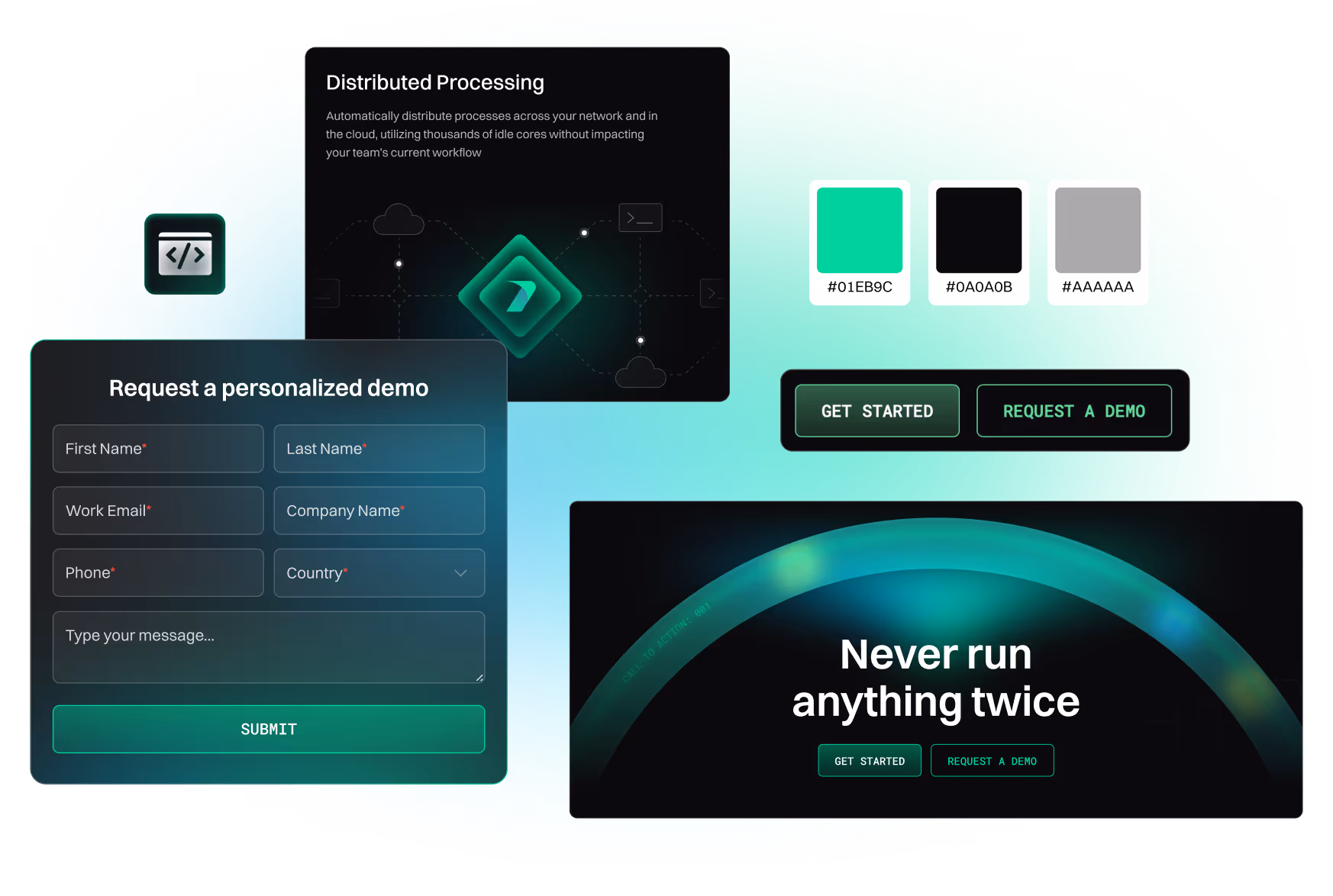
Titles, headings, and paragraphs should use the same typeface in the same size and weight consistently.

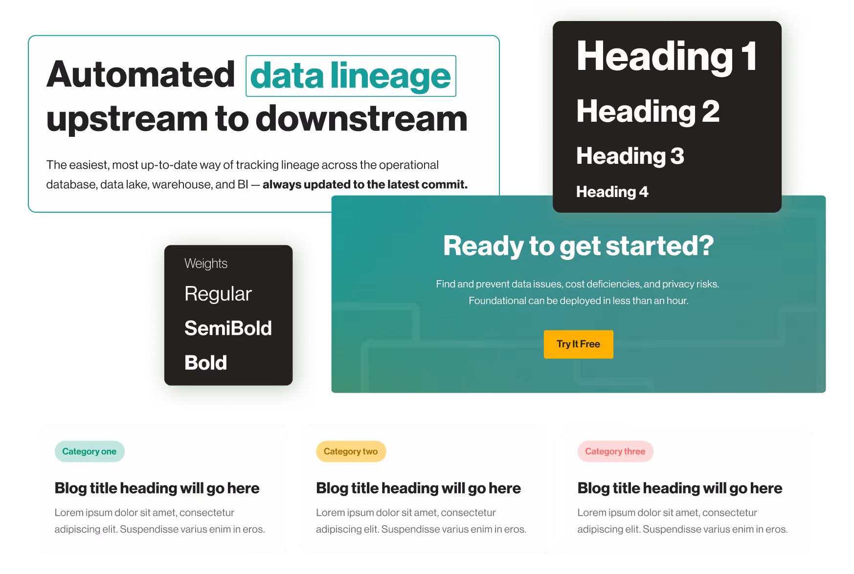

Do icons, diagrams, charts and other visuals look the same on every page? Look for consistent line thickness, complexity, corners (sharp vs. rounded), and size.

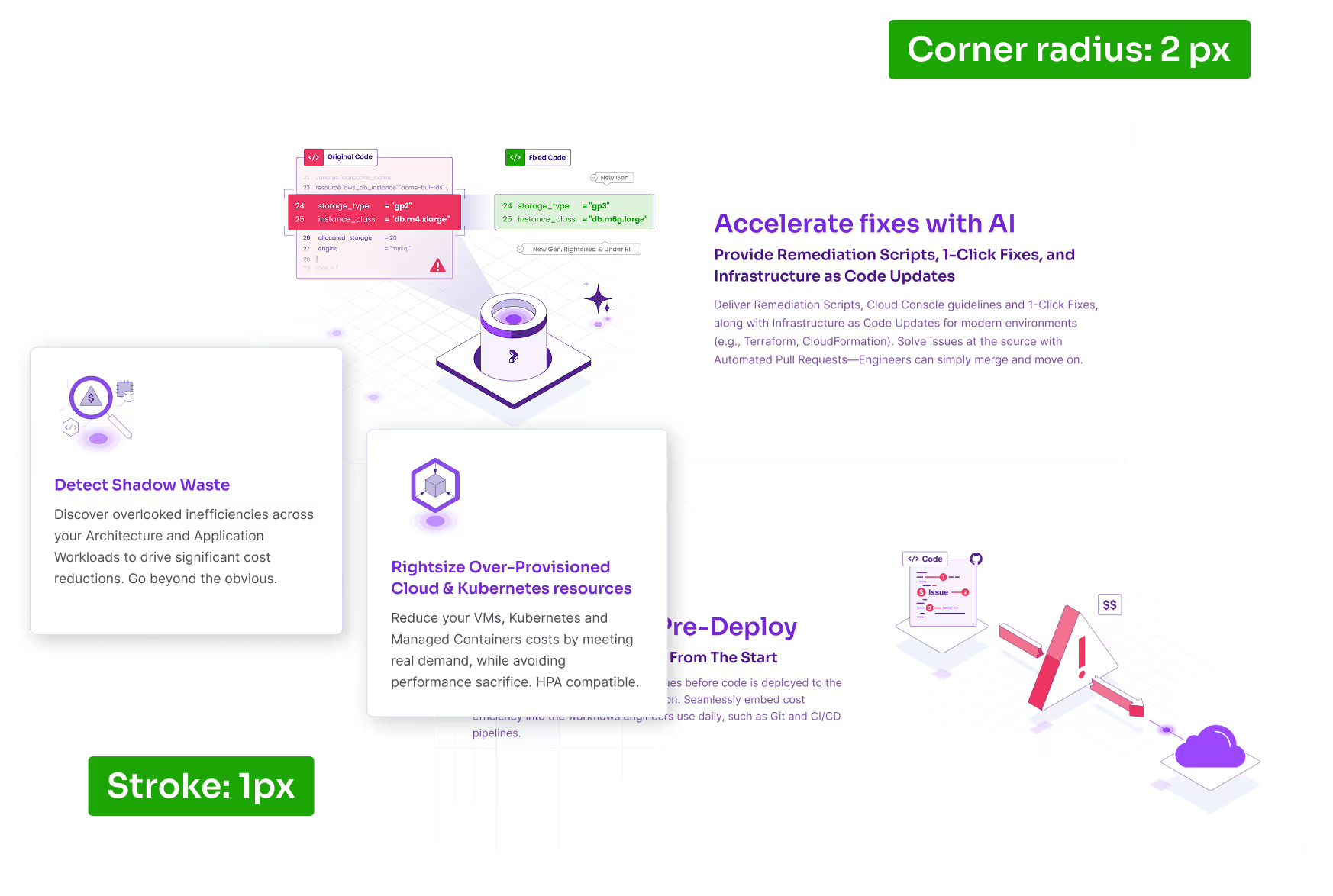

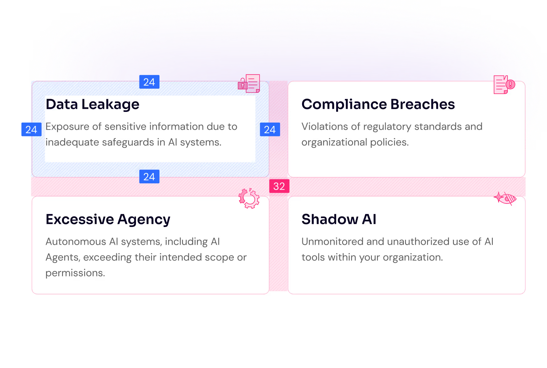
Is the spacing between sections, cards and different other elements equal within each type?

Read through every page and try to put yourself in the shoes of the audience. Challenge every piece of information and visual at the place they appear and ask these questions:

When a website uses spacing that is too tight, everything feels cramped and hurried, as if the company didn’t take the time to polish its presentation.
It’s the visual equivalent of a sales person talking really fast and trying to run through as much information as he can in a hurried monologue.
This lack of breathing room makes content harder to read, follow and interpret, creating subtle stress for the user. That stress quickly translates into unease and doubt.
The purpose of visual elements is to support the story with precise context, enrichment of details, or an additional way to clarify the message. Visuals that are not carefully selected or designed will feel off to the visitor and create an image of a company that is not detail oriented. When imagery doesn’t align with the narrative, it introduces confusion, forcing the user to reconcile mixed signals. This moment of doubt, however small, erodes trust and makes the entire brand feel less coherent and reliable.
Issues with copy are not strictly about design, but nevertheless we see them often enough to include them in this list. The two most recurring issues with copy are:
Most website visitors scan through titles and headings and if they are interested enough in a specific subject they might read the corresponding paragraph, or at least part of it.
Being confronted with a large amount of text creates a sense of lack of focus and inability to be clear and concise about the value proposition.

Long rows make reading harder and force the eyes to travel too far horizontally, increasing fatigue and making it easy to lose one’s place when jumping to the next row.

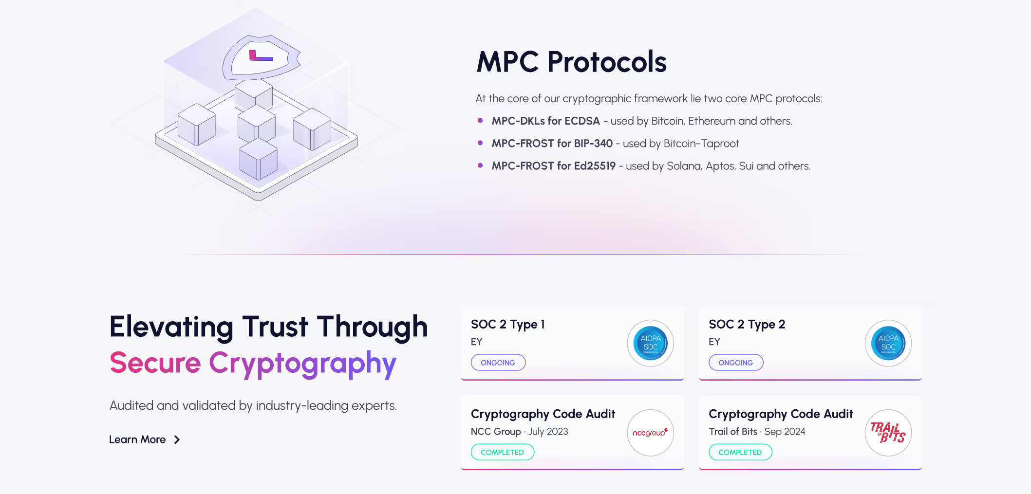
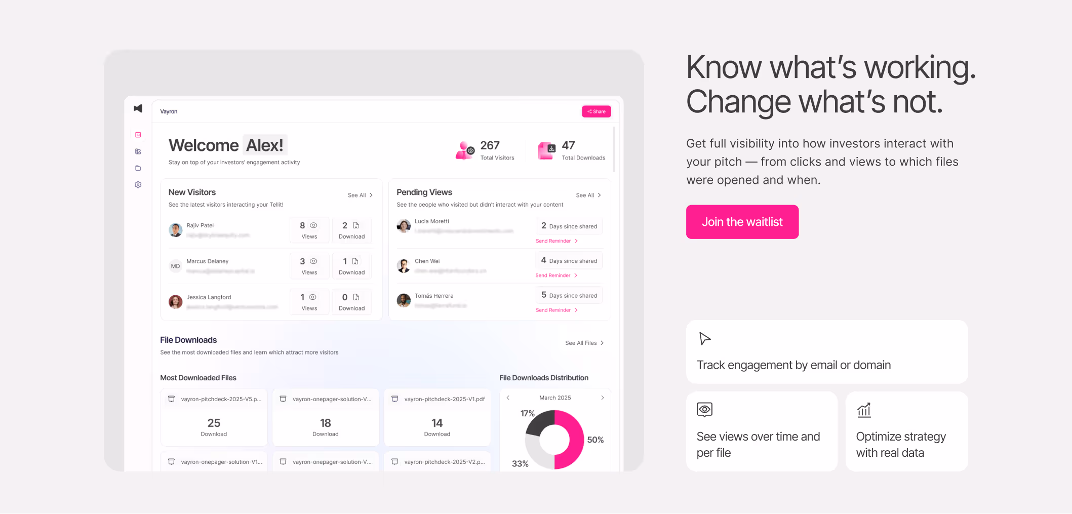
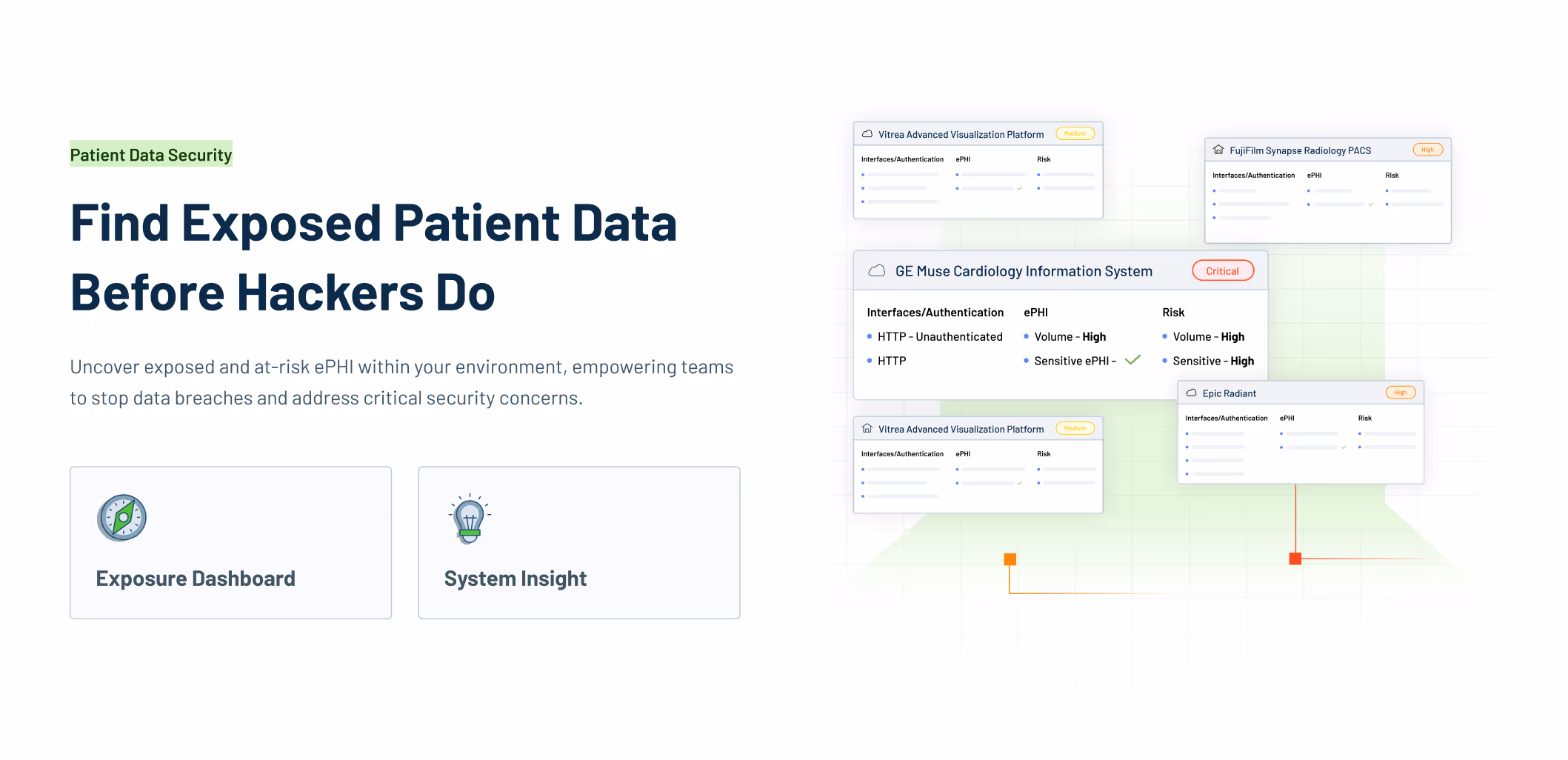
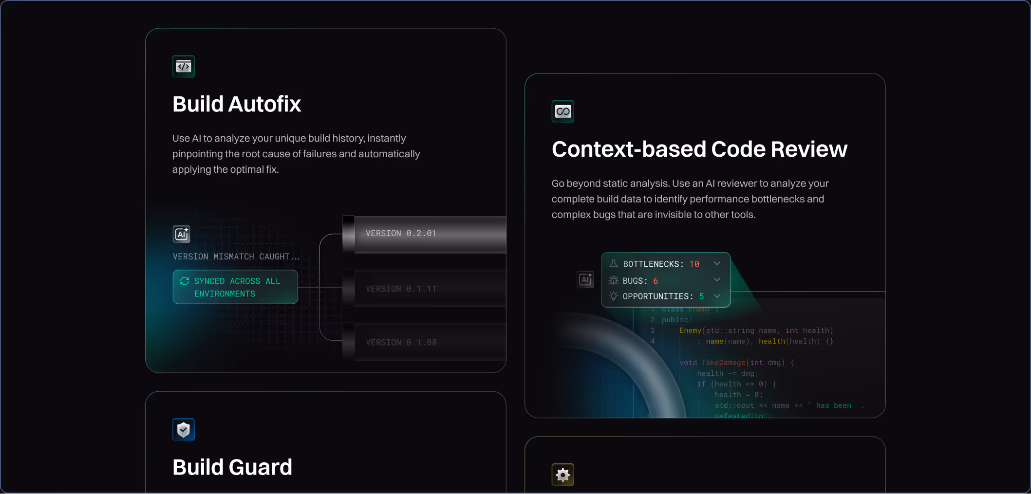
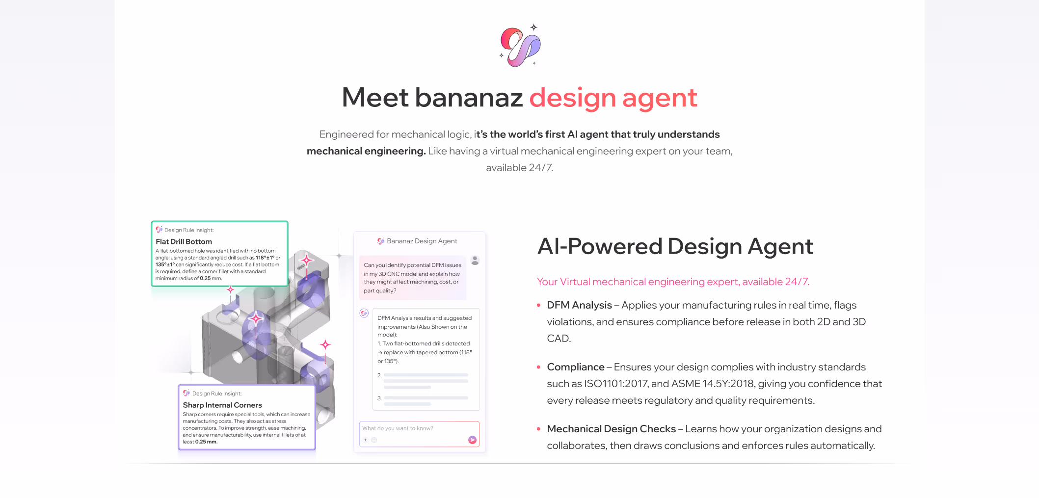
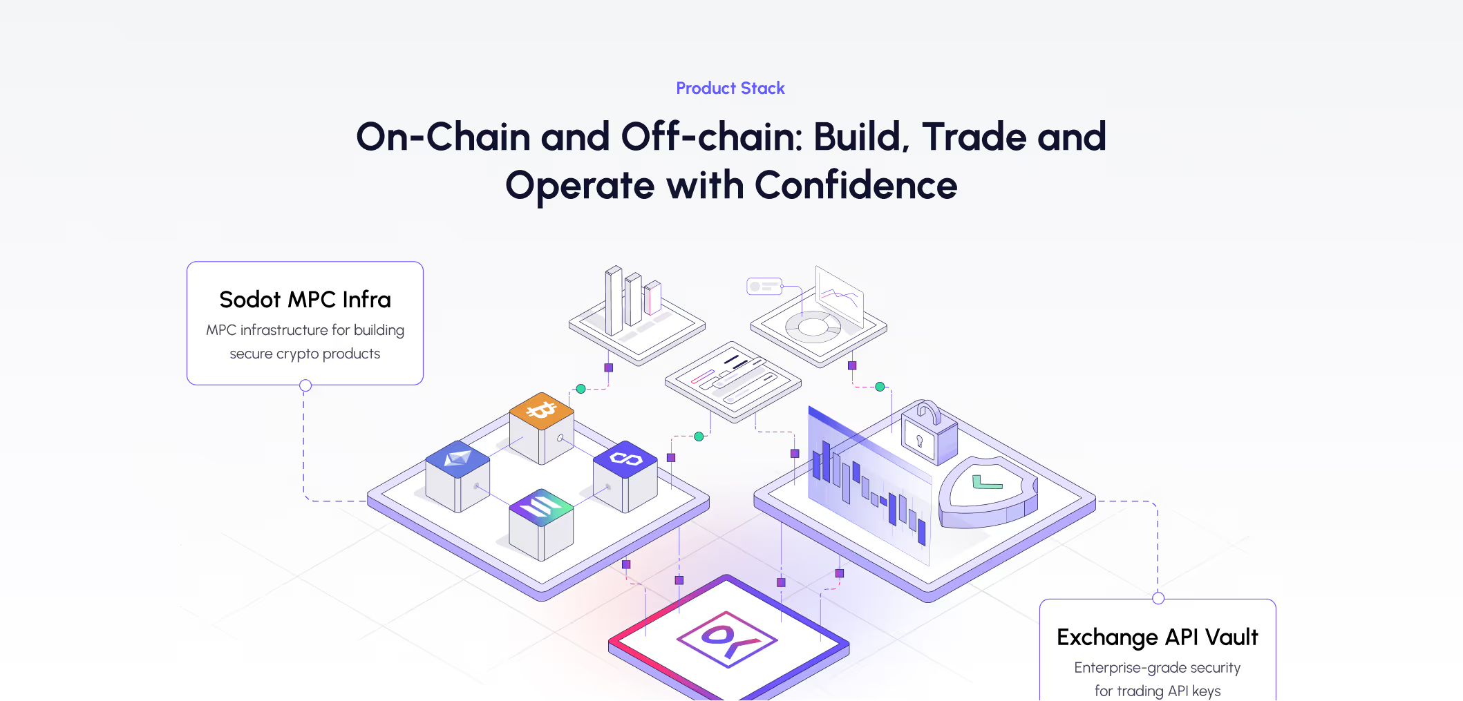
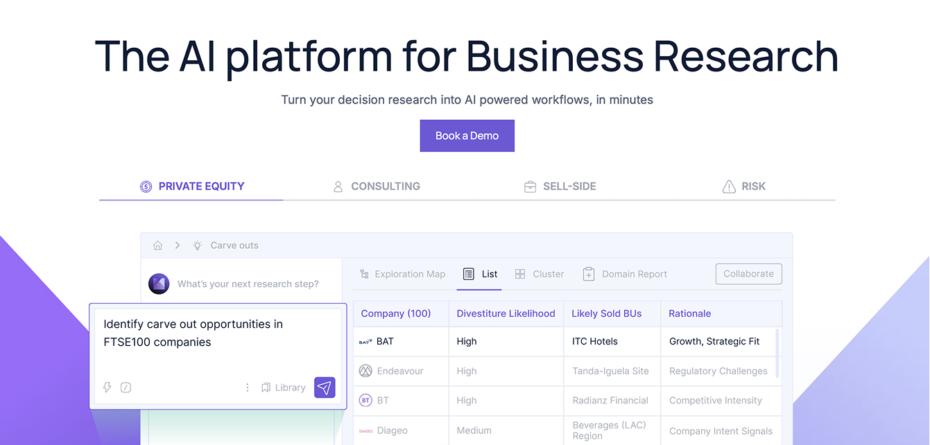
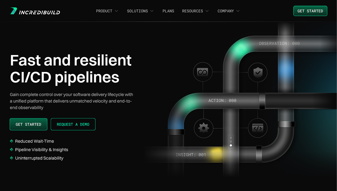
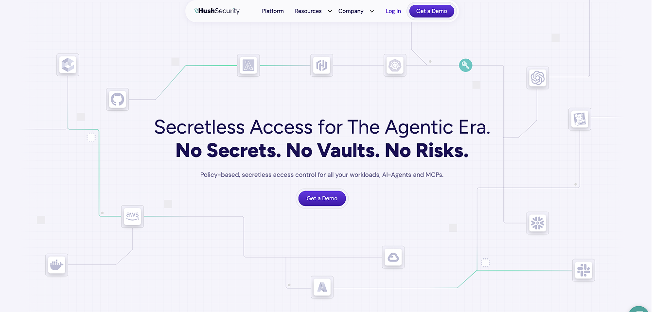
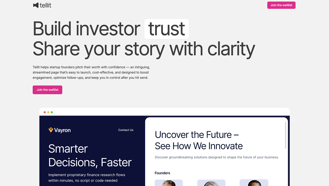
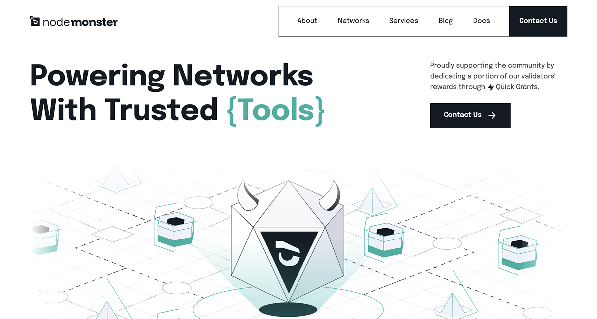
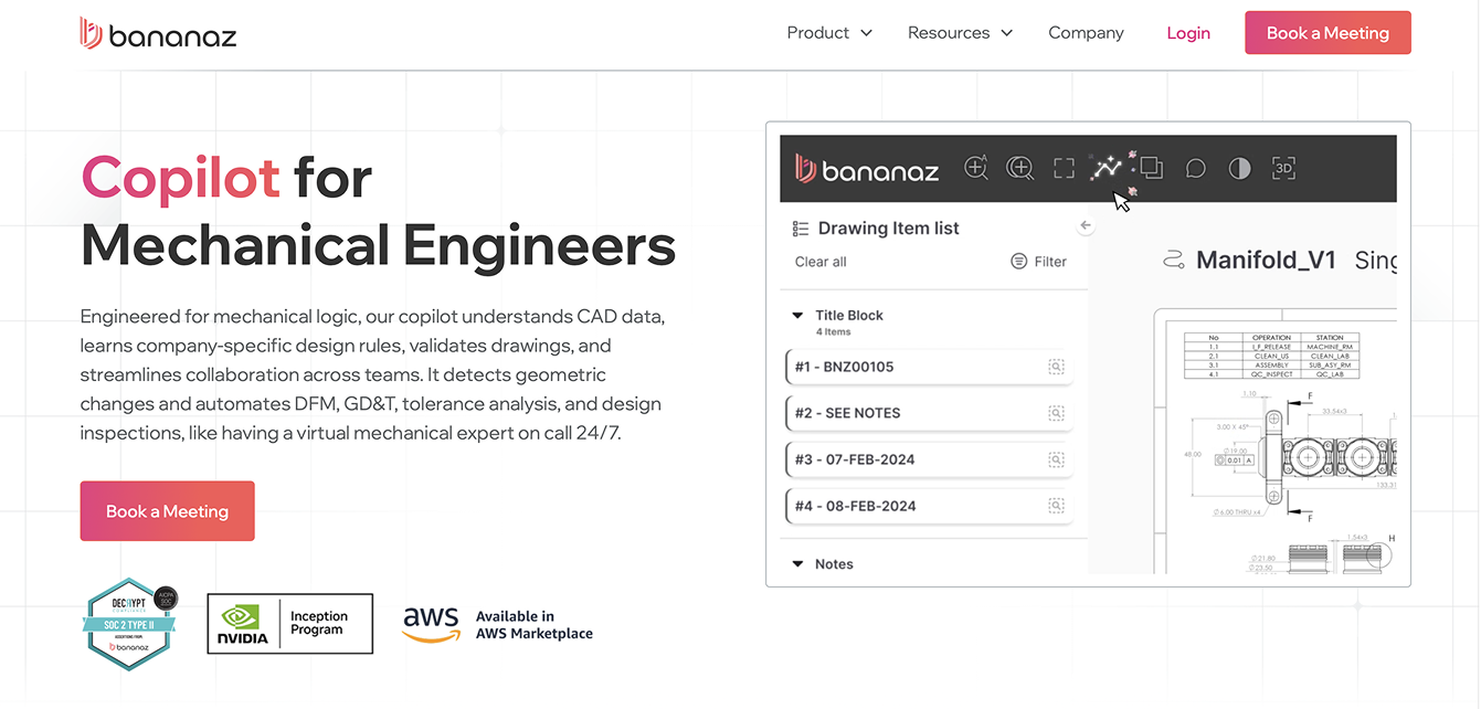
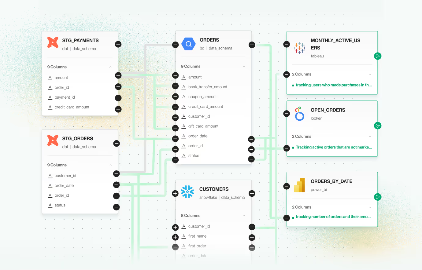
Showing the product on the website instantly boosts credibility because it proves the company has something real, functional, and thoughtfully built behind its marketing claims. Clear product screens, interface previews, or feature highlights give visitors a tangible sense of quality, how the product looks, how it behaves, and whether it feels modern and reliable.
This transparency reduces uncertainty and signals confidence: companies with strong, polished products proudly show them. For buyers evaluating risk, seeing the product early creates trust by making the solution feel concrete, usable, and ready for them today, not an abstract promise hidden behind generic visuals.
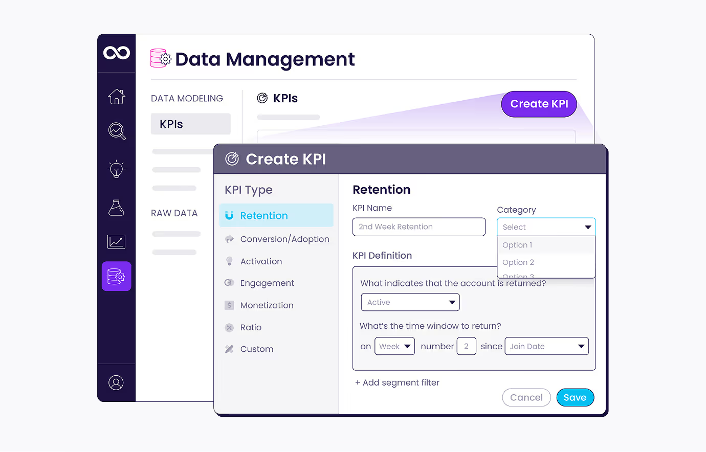
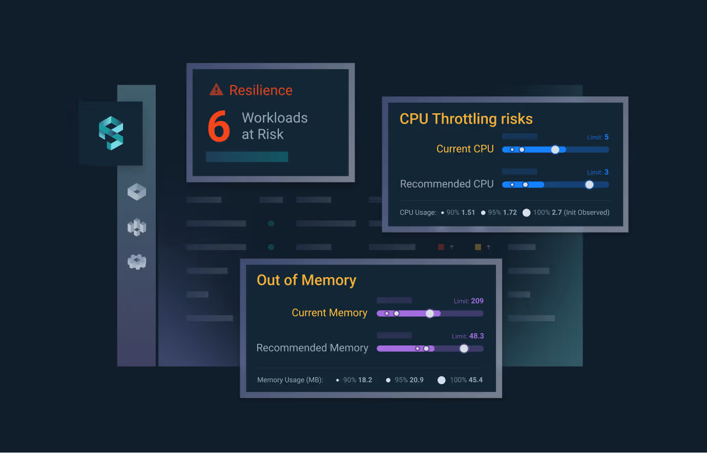
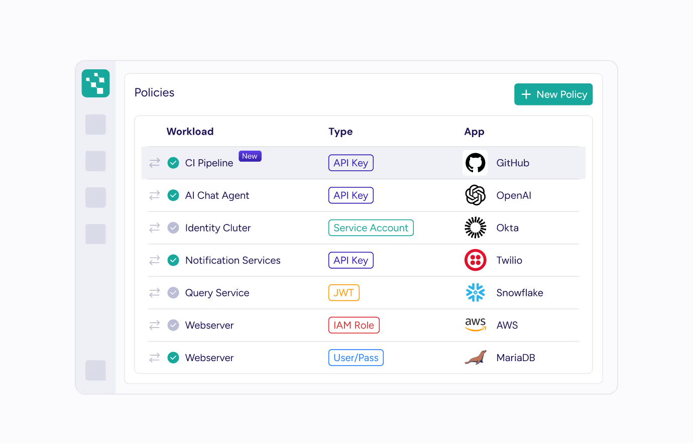
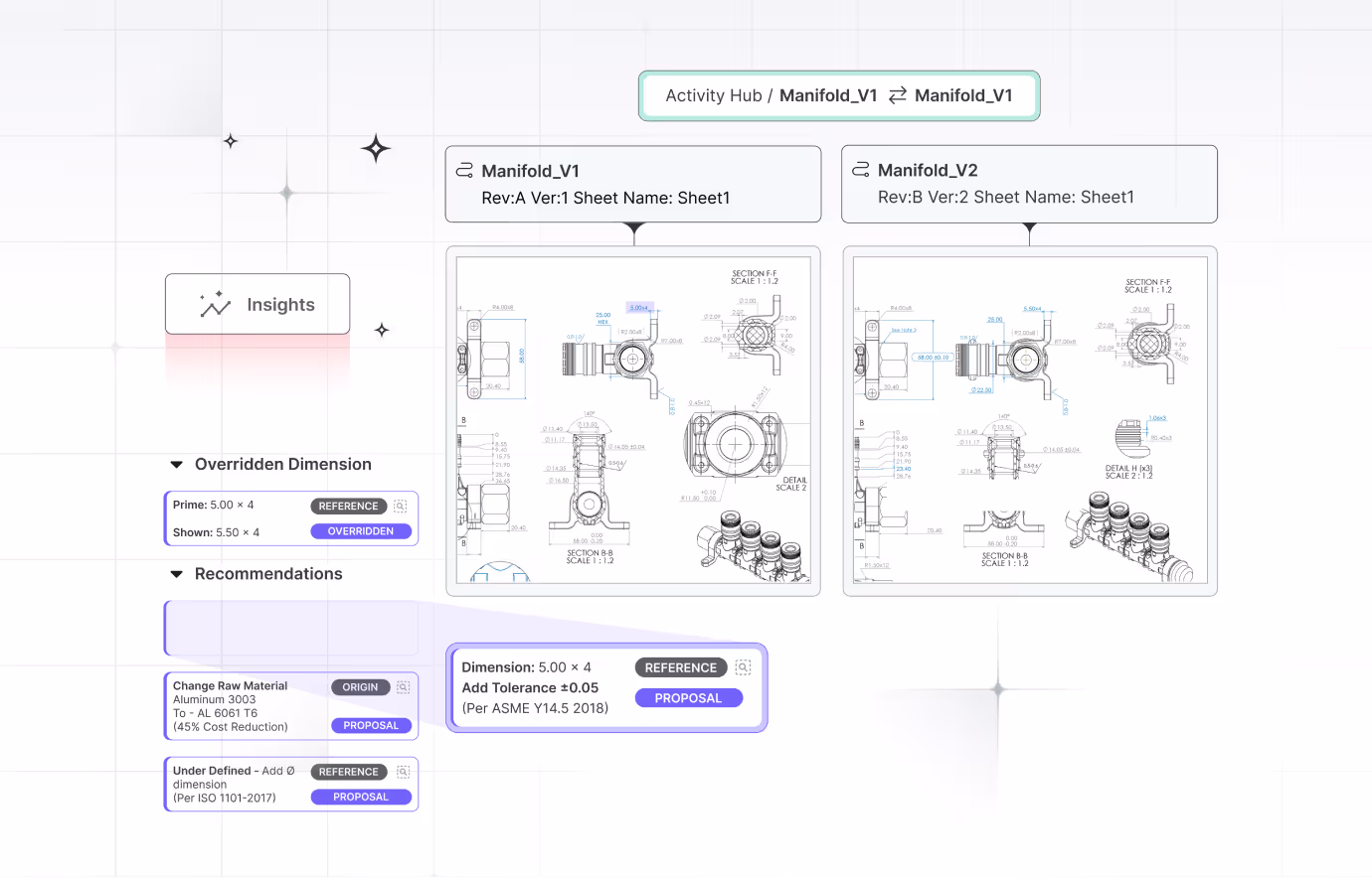
It’s rarely recommended to use a screenshot as is. Products are usually complex and display many functionalities all at once. On average, a website visitor will spend just a few seconds looking at the screen and any specific feature or capability you are highlighting in the specific section will be lost in the clutter.
When copy appears on the screenshot, it’s important to make sure that the font is large enough to read and only relevant text appears. It is best to redact any irrelevant copy in order to stop the visitor from wasting their valuable attention on reading them.
It’s also important to remember that in most cases the eyes will start with the largest and heaviest text and gradually move down to the smaller ones.
It goes without saying that the screen must be high resolution and crisp. Any blurriness, even if intentional, when trying to conceal private information, sends the wrong message and should be avoided.
Micro animations are a great pattern to use to explain how a specific flow works, however it is important to focus precisely on the interaction itself and limit the information displayed only to the parts that are relevant. A hard to follow product animation might negatively affect credibility by presenting an overly complicated product.


When a new website is launched it’s an important milestone in the lifecycle of its design, not the end. Soon new pages will be added and others changed. You will expand on some of the details and remove others. We’ve worked on company websites that started out with 4 pages and grew to 30 during the following year and needless to say that every change and addition, whether small or large, was approached with the same level of care as the initial site.

It is easy for things to degrade over time, some additions are urgent and some are done by different team members, therefore it’s our recommendation that a member of the design team takes ownership of the design for trust approach or if it’s not an option, then a member of the marketing team.
Answer a few questions to see how your audience experiences your product, then learn how to turn that insight into higher trust and conversion below.